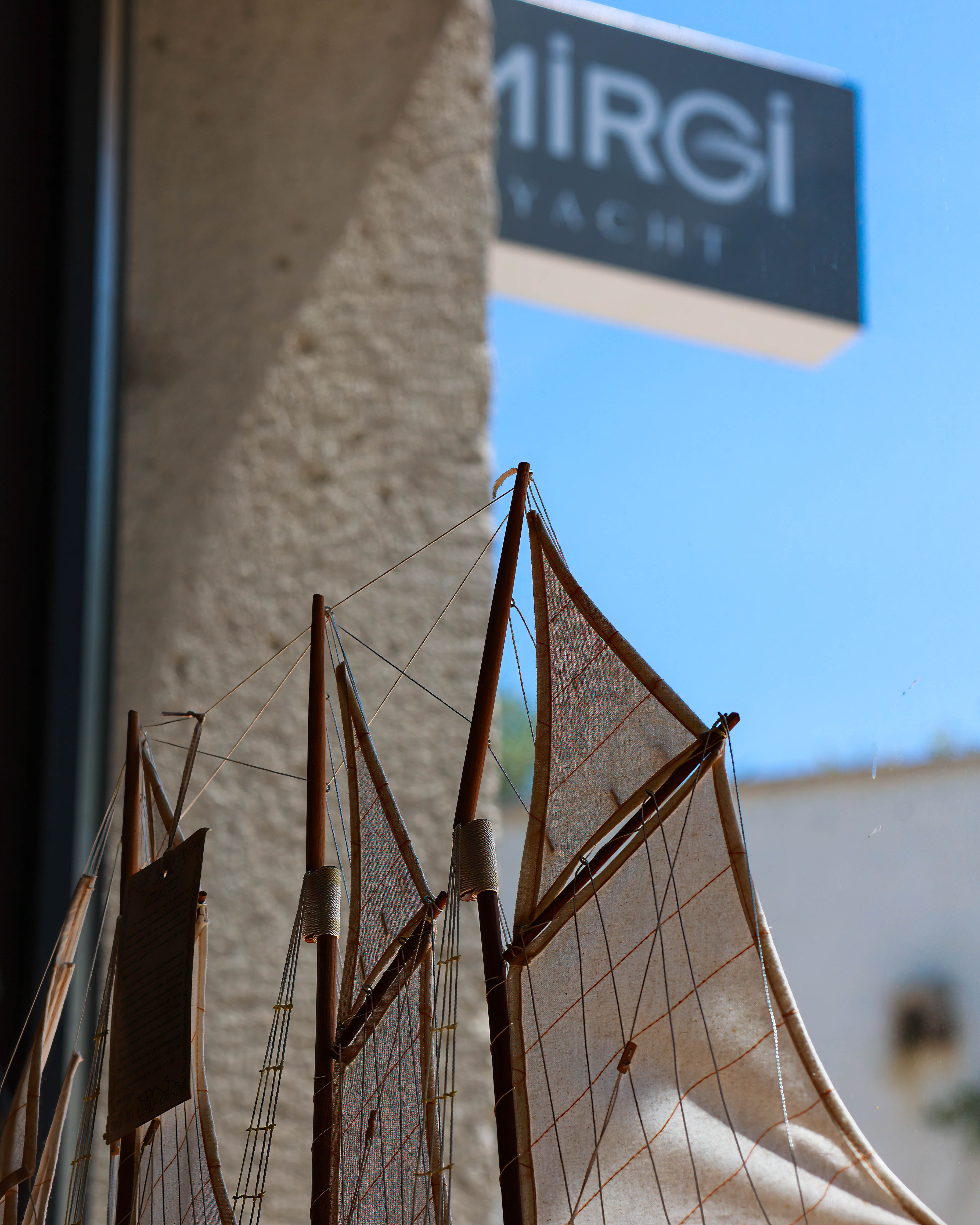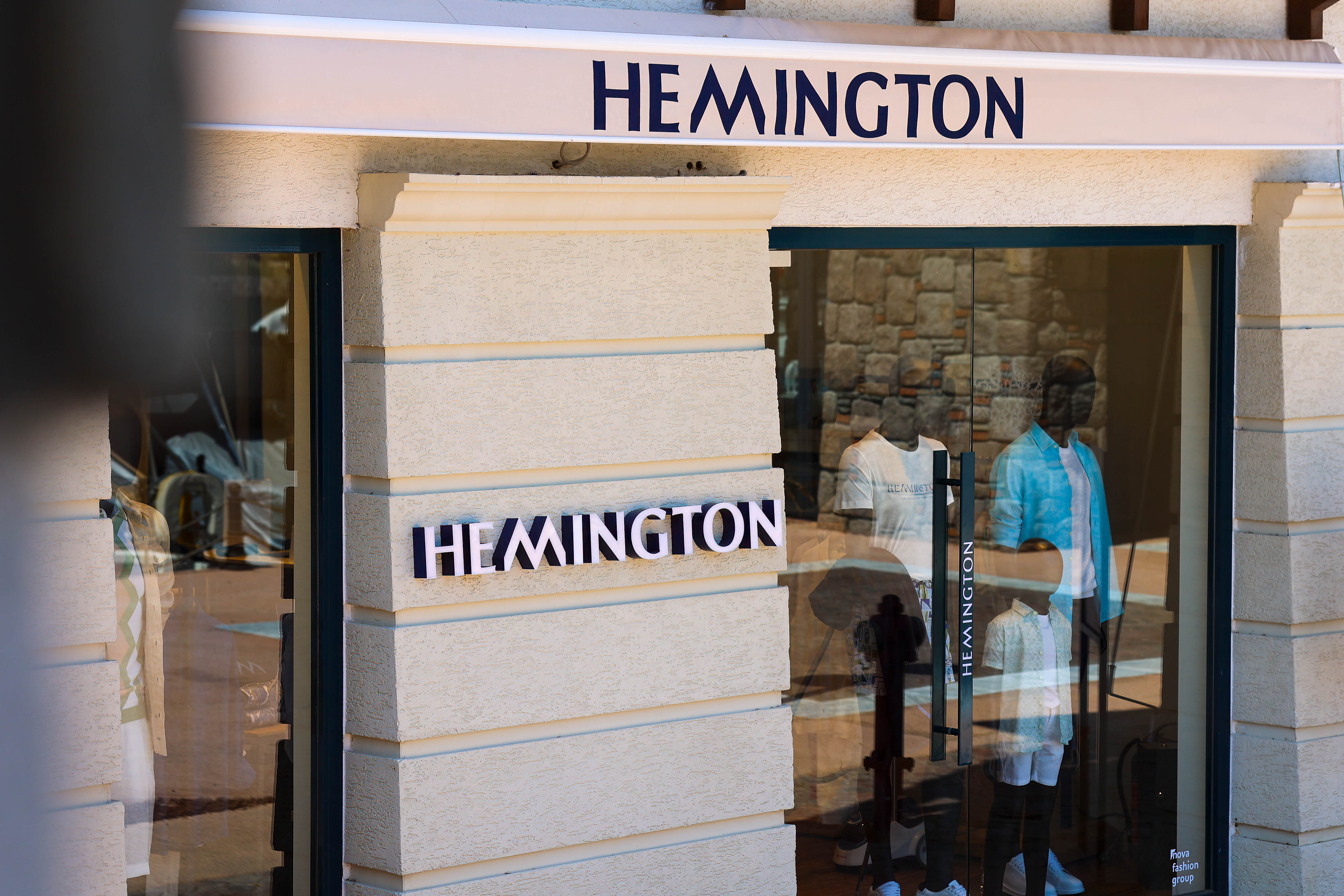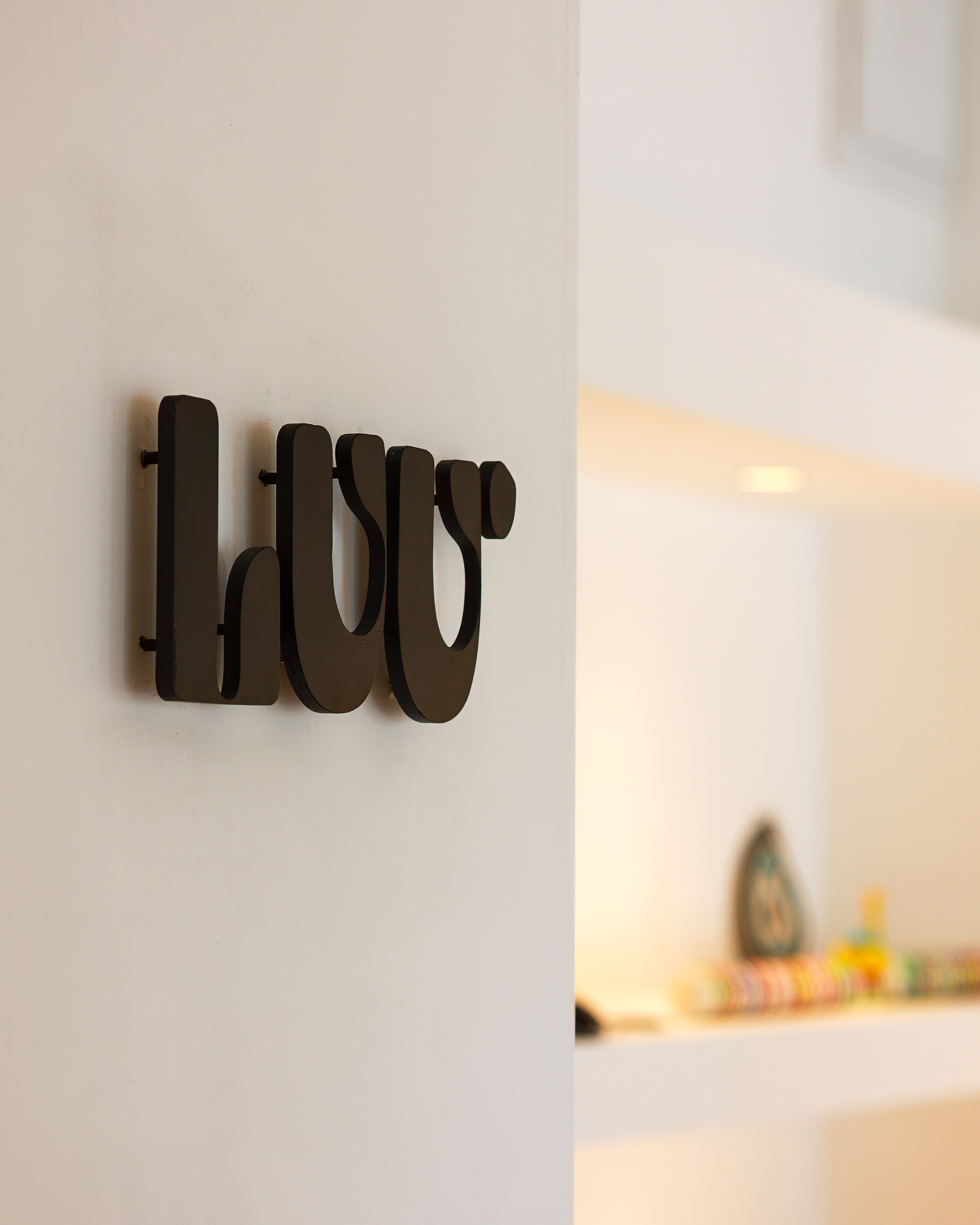
To articulate the business pulse of Anthaven, we framed scenes that carry the character of each venue. Nautical cues, stone textures, and clear summer light came together to convey trust and place. At entries, we isolated typography, wayfinding, and window displays within clean architecture so that storefront identities read quickly and confidently.
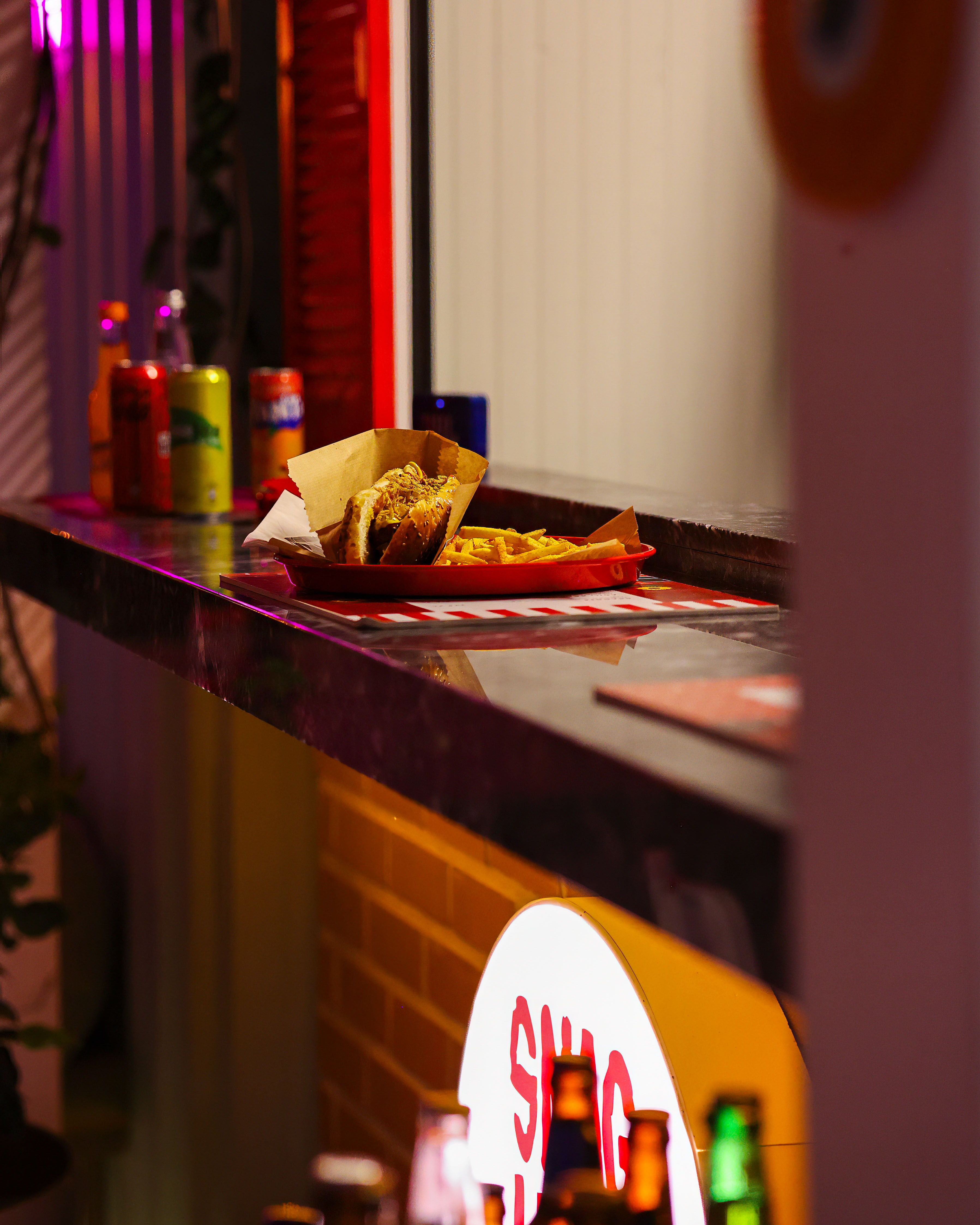
Across food and beverage, terrace layouts, translucent surfaces, and shadow play linked naturally to the waterline. Tight product compositions emphasized texture, freshness, and the immediacy of service, creating appetizing visuals ready for social and on-site screens. Outdoors, fast shutter choices and consistent white balance preserved a warm palette, while midday contrast was tuned for a natural yet striking look.
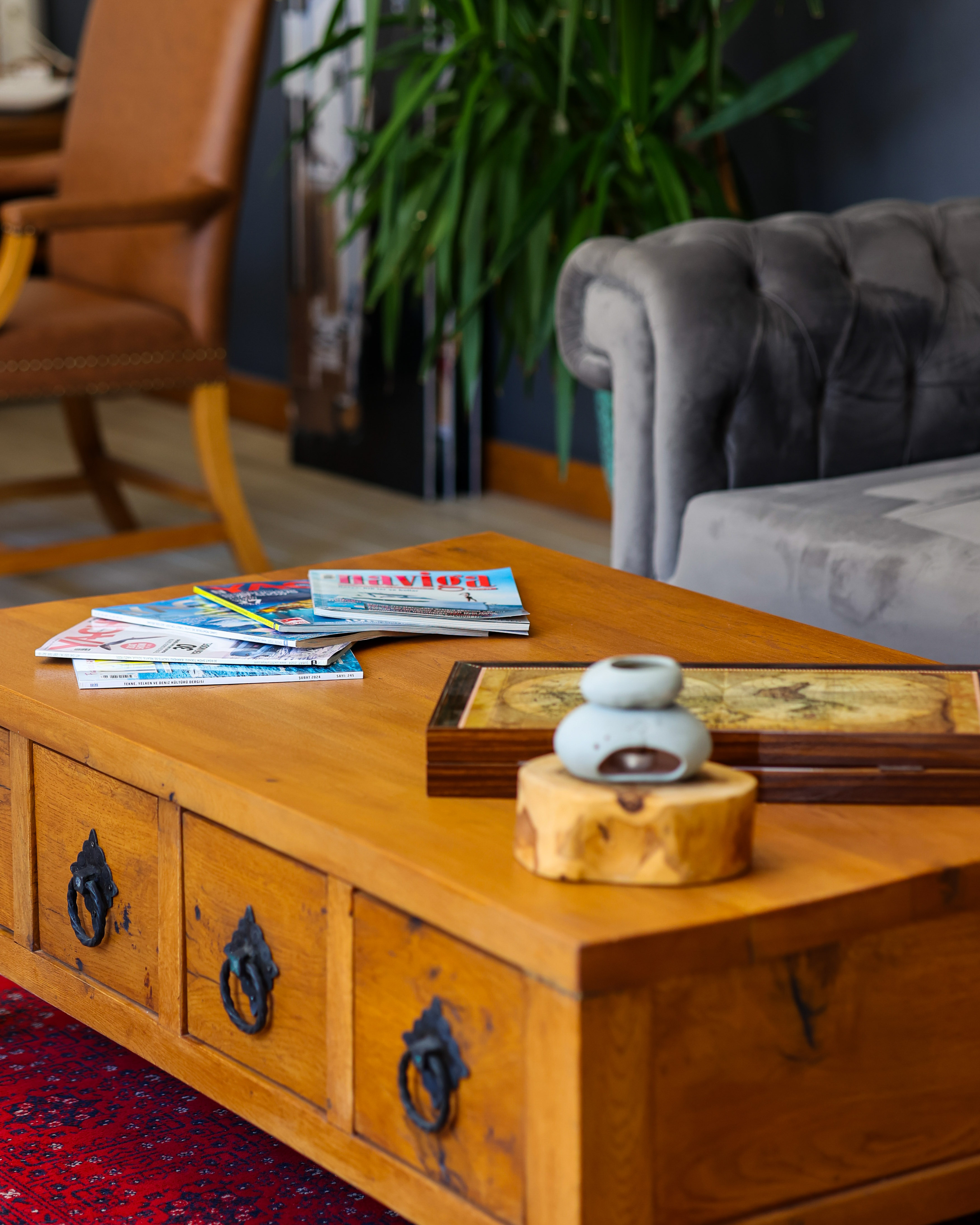
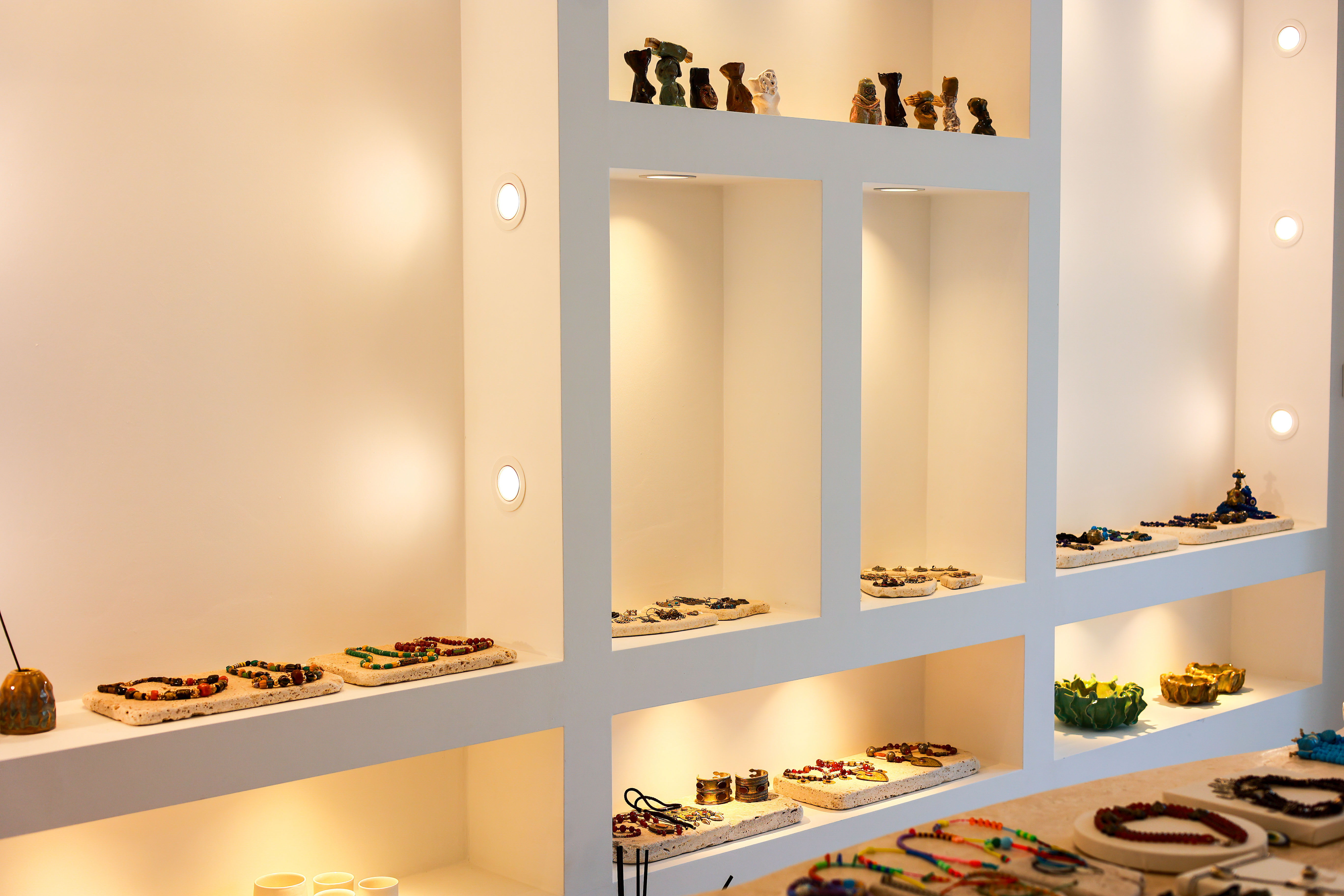
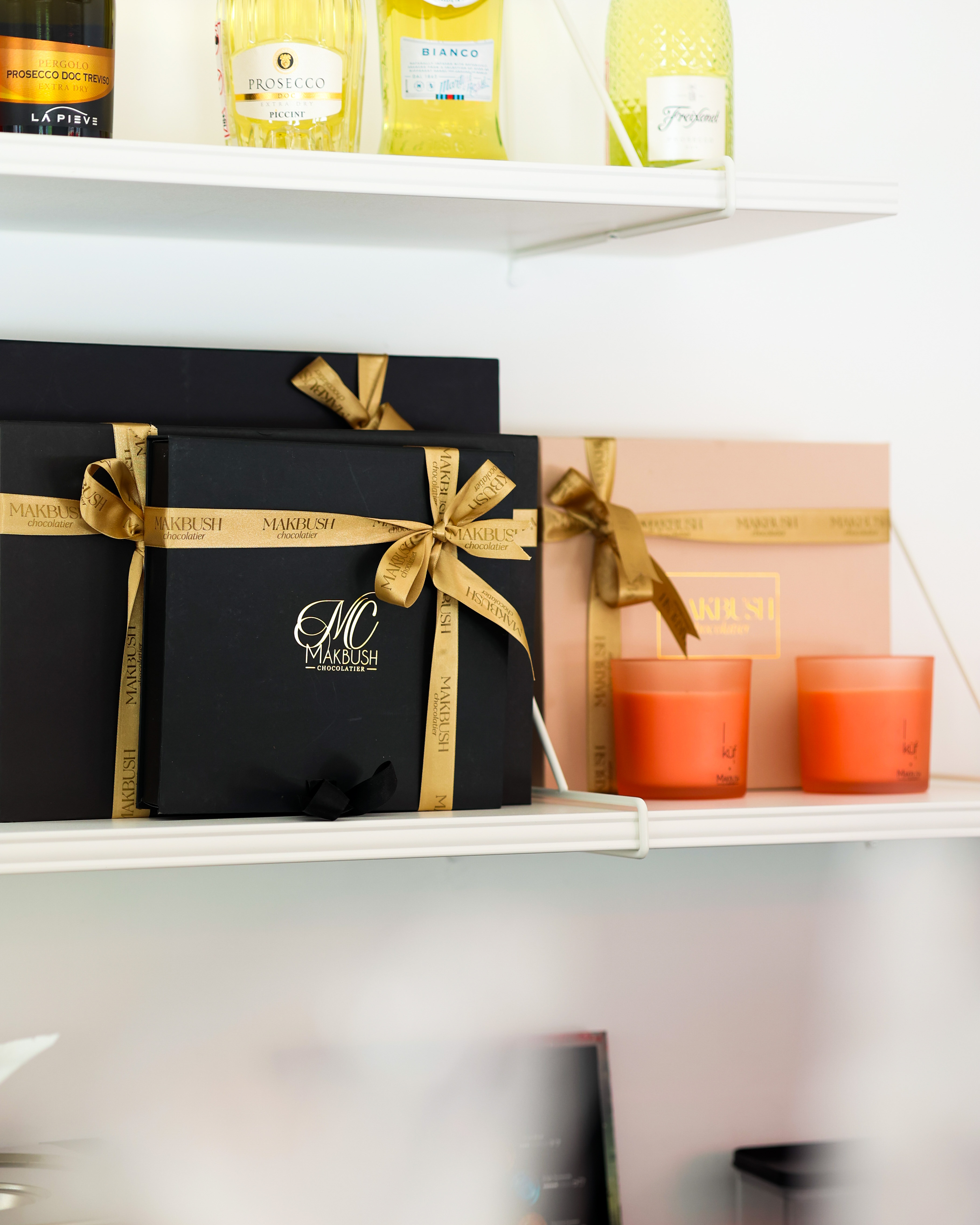
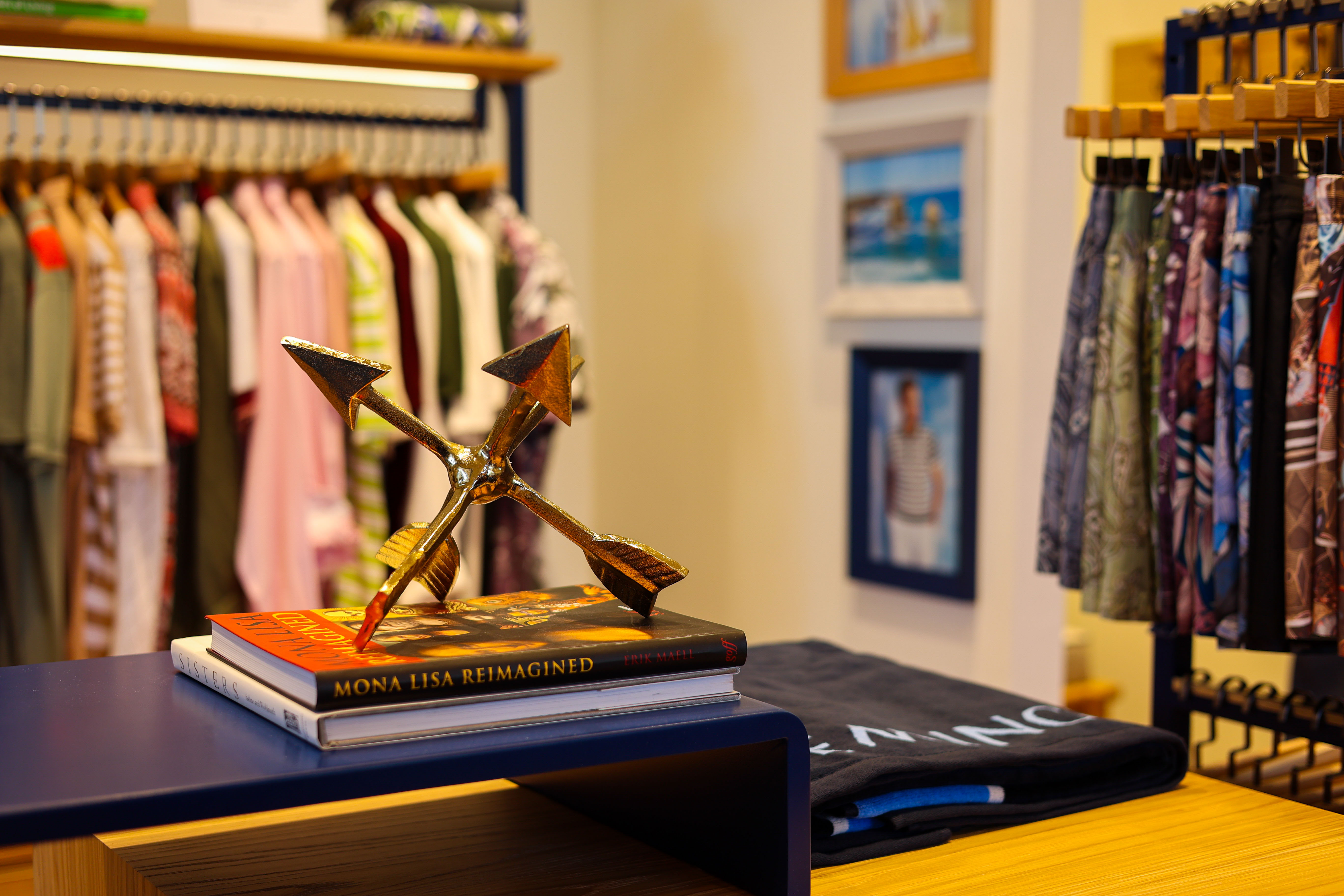
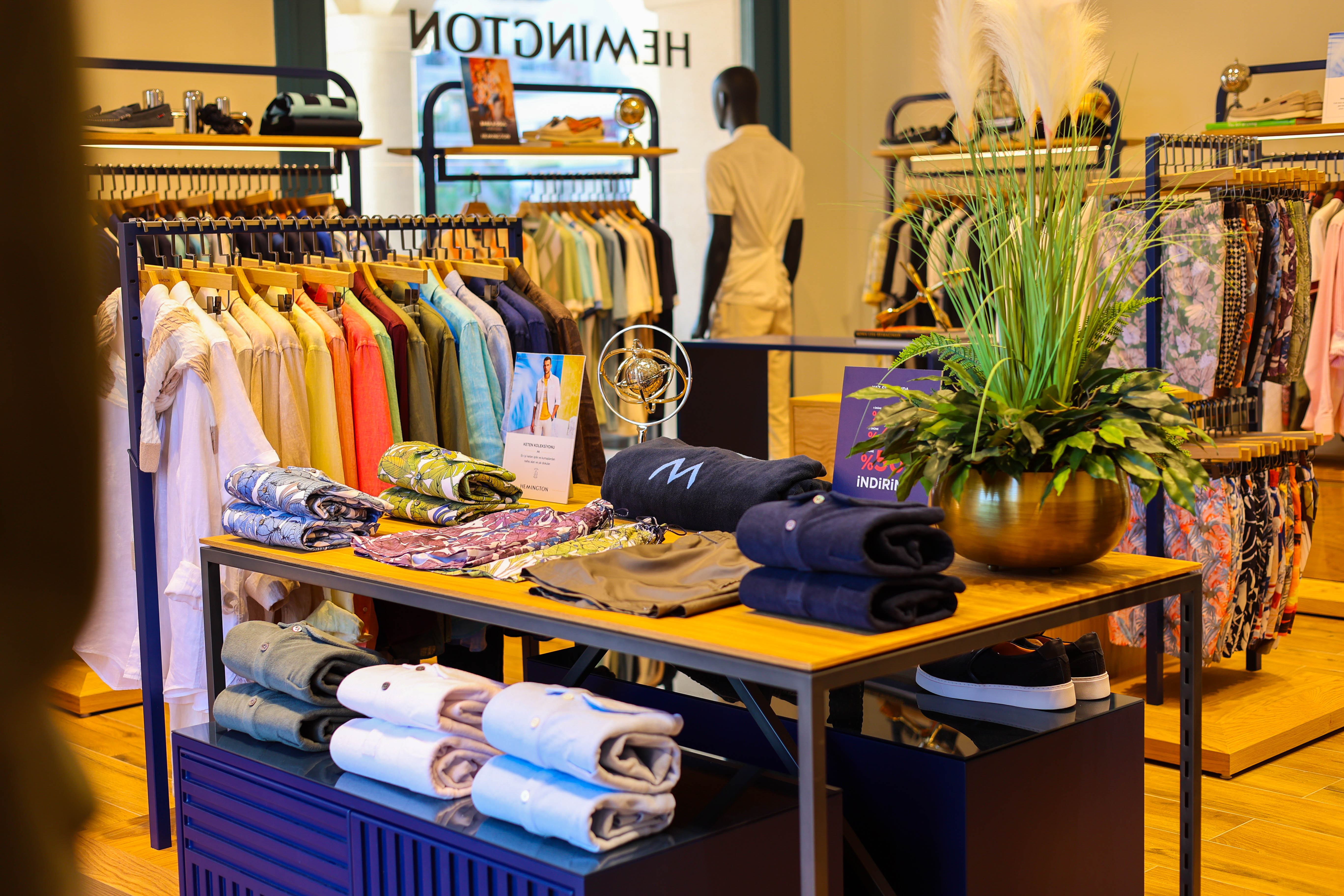
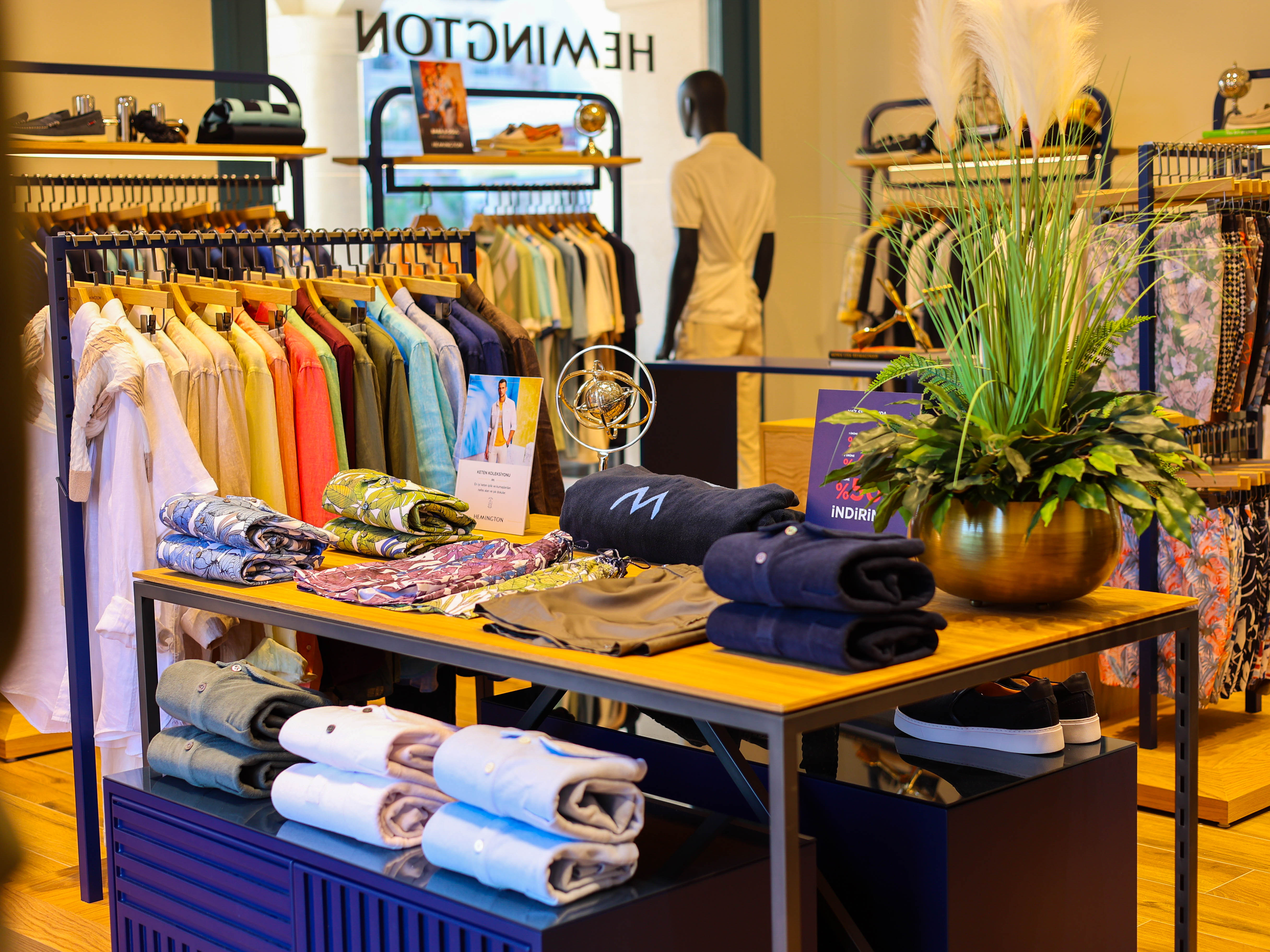
For retail, layered compositions revealed shelving logic, color rhythm, and assortment depth at a glance. We staged the relationship between counter, rail, and window to visualize the flow of browsing and purchase. In post, tone matching and local contrast refinements unified the imagery, reinforcing a single coastal narrative that celebrates the everyday life of businesses at the marina.